
Bright outdoor cushions get talked about like a risk — something you'll tire of, something that fades, something too bold for a garden or terrace. Most of that reputation is about badly-made bright cushions, not bright color itself. This is part of our outdoor cushions selection series — practical, fabric-first guidance for choosing what actually holds up.
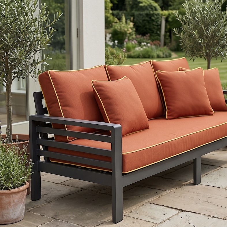
A Cushiere sofa set in Canvas Terracotta with a Canvas Buttercup contrast pipe — photographed at delivery.
Every outdoor space eventually asks the same question: stick with a safe neutral, or commit to a color that actually shows up. Bright cushions are the fastest way to change how a patio, balcony or garden feels — faster and cheaper than new furniture, a new pergola, or new planting. But they carry two real worries: will they fade into an embarrassing chalky version of themselves within a year, and will you regret committing to something this loud. Both are worth answering honestly before you order anything.
This is the part most people get backwards. A cheap printed outdoor fabric fades fast in bright colors because the color sits on top of the fibre as a surface print — sunlight breaks that layer down, and a saturated red or yellow shows the damage far sooner than a muddy beige does, simply because there's more color there to lose.
Sunbrella fabric doesn't work that way. It's solution-dyed — the color is mixed into the liquid acrylic before the fibre is even formed, so the color runs all the way through every thread, not just across its surface. UV light has nothing to strip off. That's why Sunbrella can carry a genuine hot pink or crimson with the same fade resistance as its beiges — the pigment isn't more exposed just because it's more saturated. If you want the full mechanism, we've written about it separately: what actually wears out outdoor fabric.
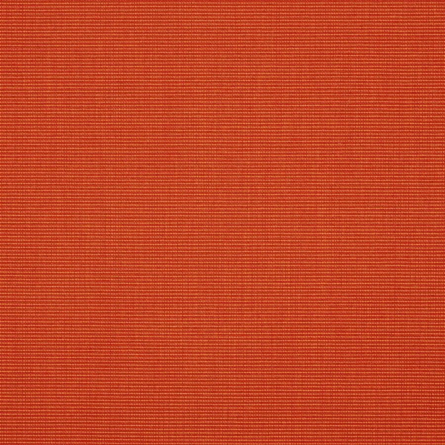
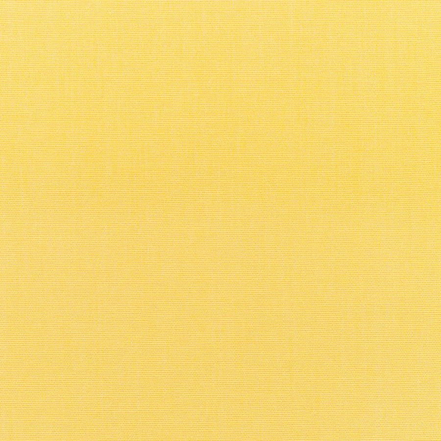
Canvas Terracotta with Canvas Buttercup, straight from the workshop — a warm, confident pairing without either color competing for attention.
Once fading is off the table, the decision is really about dose. There are three honest levels to choose from, and none of them is the "correct" one — they suit different spaces and different appetites for commitment.
One bold color, one supporting neutral: a terracotta or crimson seat cushion paired with a warm beige or charcoal back cushion. This is the easiest bright choice to get right on a first attempt — the neutral does the work of making the bright color look chosen rather than accidental, and you can swap either half later without starting over.
Full commitment: every cushion in a saturated color, the way you'd see on a full dining set or a long daybed. This reads as intentional and confident, but it needs a fairly neutral backdrop to work — stone, timber, greenery — so the color has something quiet to sit against. It's the hardest to walk back if you change your mind, so it suits a space you're fairly settled on.
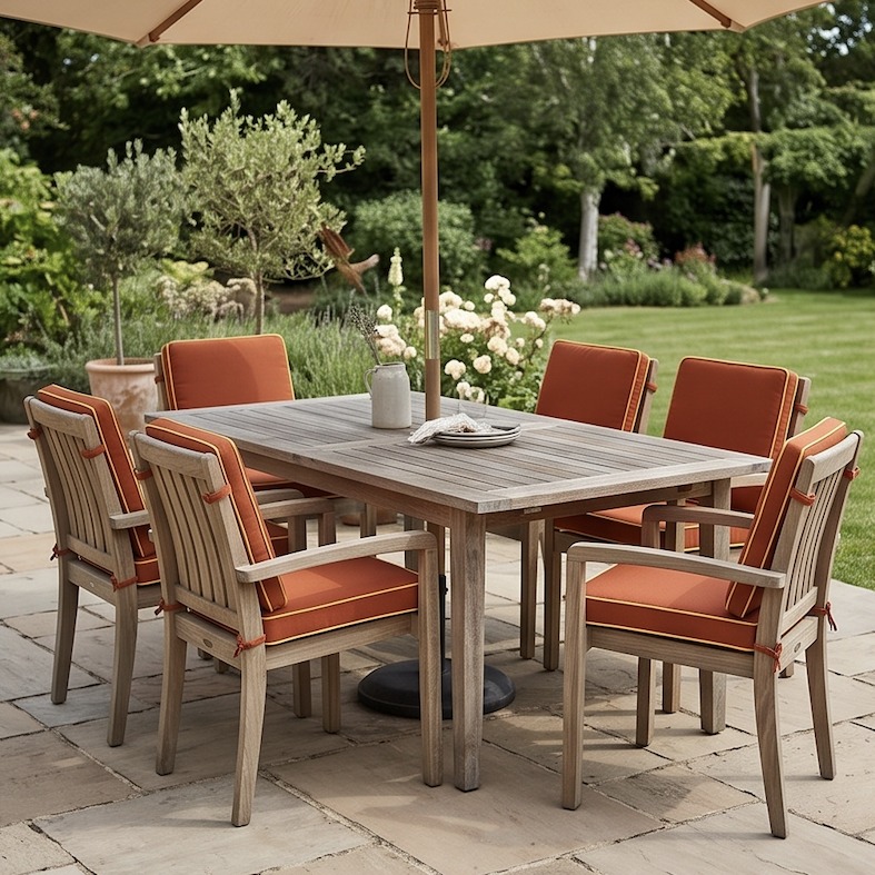
A full dining set finished in the same terracotta-and-buttercup pairing, delivered to a customer — six chairs, one confident color story.
Bright as an accent only: a neutral or bold cushion with a contrast piped edge in a second color — a terracotta body with a buttercup-yellow pipe, for instance. This is the lowest-risk way to bring color into a space, since the bright shows up as a line, not a field. It's also the easiest to change your mind about, since it's a much smaller fabric commitment.
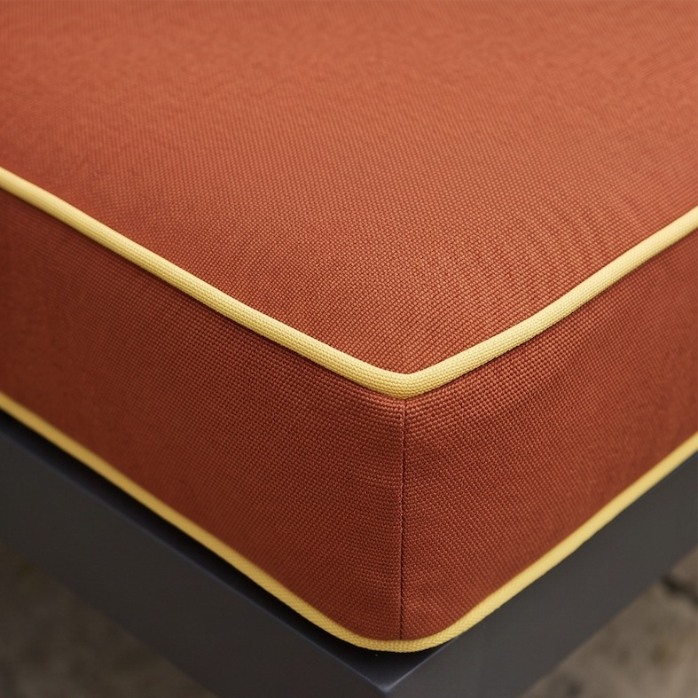
The accent approach up close — Canvas Buttercup piping along a Canvas Terracotta seat cushion.
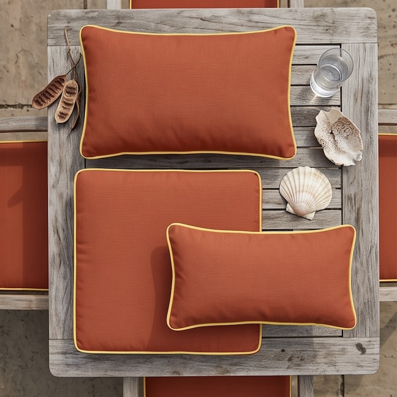
The same pairing against teak and shell — natural materials do the work of calming a bold color.
A genuinely bold color works best as the loudest thing in the space, which means everything else needs to step back. Timber furniture, stone paving, and greenery are all naturally muted, so they make excellent backdrops without any extra effort. Where this goes wrong is pairing one bright with another — two competing saturated colors read as chaotic rather than confident, no matter how well each one is made. If you already have a patterned umbrella, striped rug, or colorful planters, let the cushions be the single accent rather than adding to a pile of competing colors.
If you're testing whether bright colour actually works for your space, start with the accent-piping option — it's the smallest possible commitment and the easiest to build on later. If you already know you want color and just want it to look intentional, go with one bold color plus a neutral. Full commitment is for a space you already know well, where you're confident the color will still feel right in two years, not just in the first excited week after it arrives. Whichever level you pick, the same rule holds across any outdoor cushions selection: let the fabric, not the trend, decide how bold you go.
Browse the fabric library