
Cushion trends move slower than fashion, but they do move. Here are three directions we keep seeing pinned, saved, and asked about — and what each one actually takes to build.
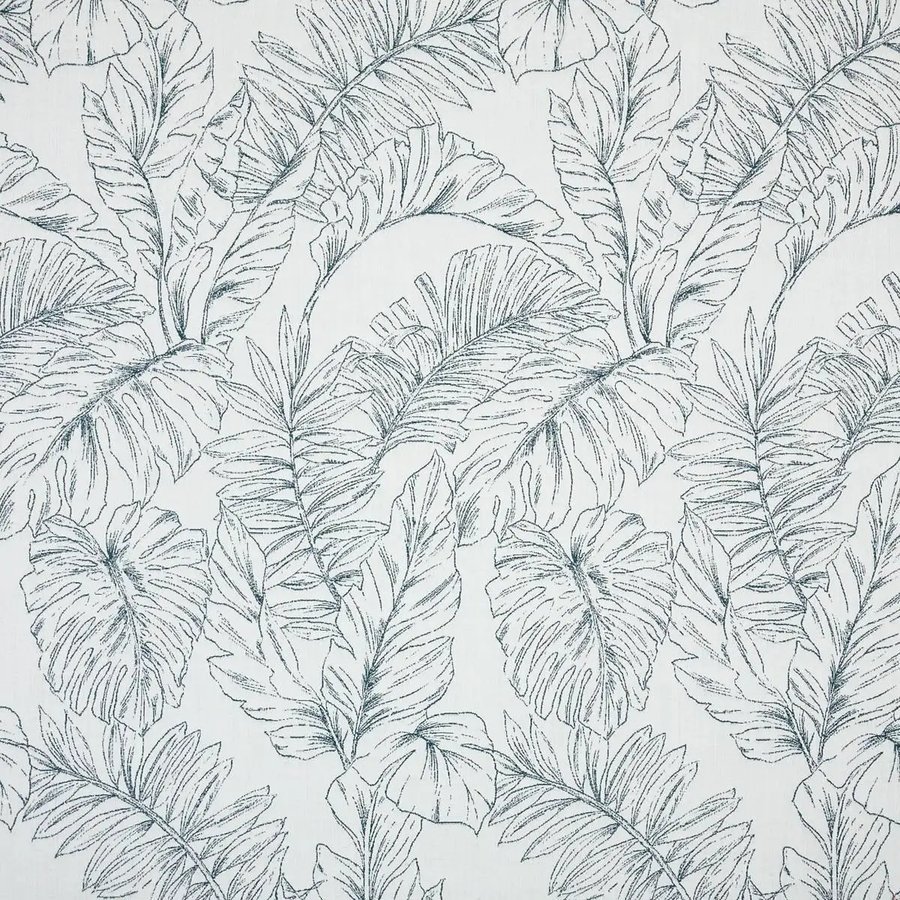
Calm Laurel, one of our Patterns-category Sunbrella fabrics.
Scroll enough interiors content and the same handful of moods keep resurfacing: a breezy coastal stripe, an oversized botanical print paired with bold solids, and a quieter, more illustrated take on the same leaf-and-branch motif. They read as completely different styles, but each one comes down to a specific combination of pattern scale, color intensity, and how many fabrics are actually in play at once.
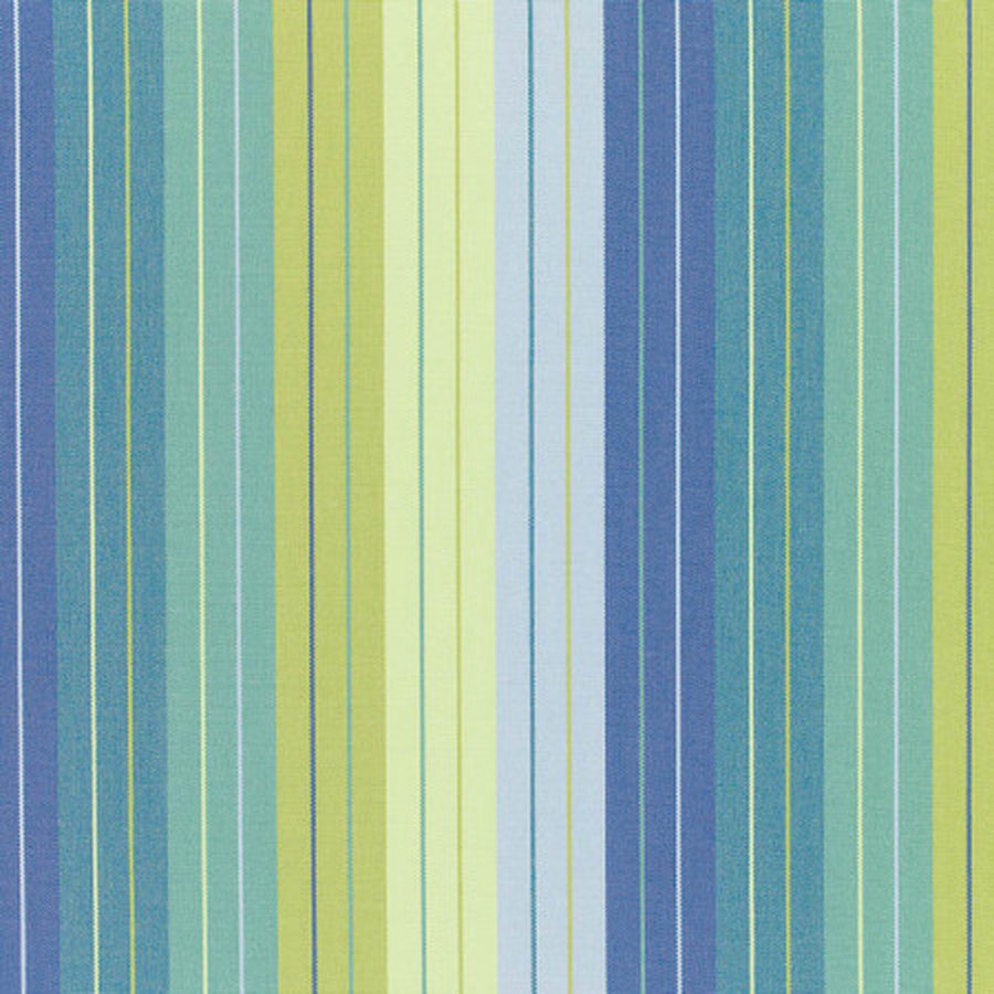
Seville Seaside — one of our Blue-Green Sunbrella fabrics.
The mood: ocean-adjacent without being literal — think a shaded daybed somewhere warm, more about the quality of light than any one specific color. It reads through a stripe that carries several related tones at once rather than a single flat block of color, so it still feels calm even when it's genuinely quite saturated.
How to build it: one multi-tone stripe like Seville Seaside is often enough on its own — the fabric already does the color-mixing work a plain solid can't. If you want to temper it, pair it with a quiet warm neutral on a second cushion rather than another stripe, so the pattern has one place to be loud and one place to rest.

Calm Laurel paired with Canvas Terracotta — a large print carried by a solid accent.
The mood: confident and a little tropical, built around one large-scale, high-contrast print doing most of the visual work, then grounded by one or two solid colors pulled from within it. It's the opposite approach to the coastal stripe — here the pattern is the whole point, and everything else exists to support it.
How to build it: put the large print on your main seat cushions — it needs the space to actually read as a leaf, not an abstract texture — and use a solid pulled from the same warm register (terracotta, rust, warm charcoal) on back cushions or a bolster. Resist adding a second pattern into this mix; bold botanical prints want negative space around them, not competition.
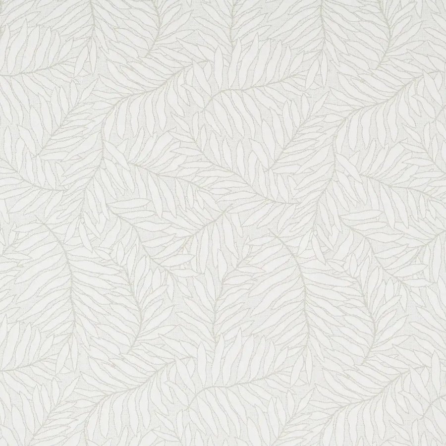
Lively Saga — a tonal leaf print in our Patterns category.
The mood: still botanical, but dialled almost all the way down — a leaf motif rendered in tones so close to the base fabric that it reads as texture before it reads as a print. Where the bold direction above wants contrast, this direction wants restraint; it's the pattern for someone who wants depth and interest without the room ever feeling "themed."
How to build it: this one can carry a whole seating area on its own without needing a second fabric to balance it — the low contrast means it won't fight with cushions, throws, or upholstery already in the room. If you do want a second fabric alongside it, keep it equally quiet; this direction loses its point the moment something louder sits next to it.
None of these is more "correct" than another — they solve for different things. Coastal stripe is the easiest to get right on a first try, since one fabric does most of the work. Bold botanical makes the strongest first impression but needs the most restraint around it. Quiet illustrated botanical is the one that ages best in a room you're not planning to redecorate again soon.
Browse the fabric library